
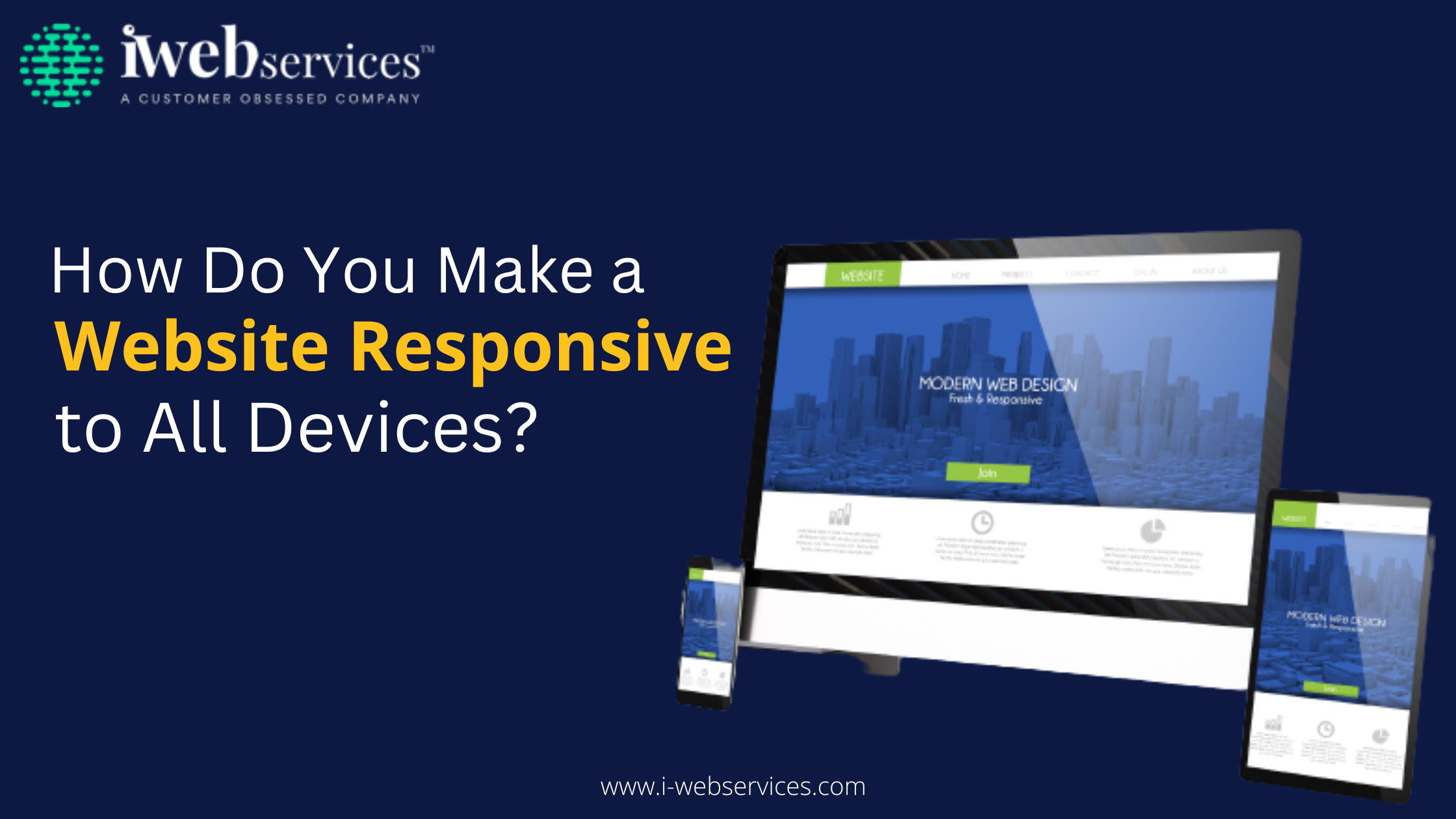
3 Best Responsive Web Design Practices You Should Know

With the rise of mobile devices, responsive web development has become an essential element of web development. This trend is set to continue, thanks to the ever-evolving landscape of technology and the increasing demand for a seamless user experience on multiple platforms. Responsive web design services allow websites to adjust automatically to any given device or screen size – be it a laptop, desktop, tablet, or smartphone – without sacrificing usability or aesthetics. To help you stay ahead of the curve, here are three best responsive web design practices you should know.
Mobile-first Approach
A mobile-first approach to responsive web design means that your website is designed specifically for mobile devices before it is designed for desktop computers. This approach is important because it ensures that your website will work well on all devices, not just those with large screens. There are a few things to keep in mind when taking a mobile-first approach to responsive web design.
- Use a responsive design framework.
- Make sure your images are optimized for different screen sizes. This means using smaller images on mobile devices and larger images on desktop computers.
- Use CSS media queries to make your website look its best on different screen sizes.
- Test your website on all devices
Reduced Loading Time
When it comes to responsive website development, one of the most important things to keep in mind is loading time. Users are more likely to abandon a website that takes too long to load, so it’s important to make sure your responsive site is as speedy as possible.
There are a few ways to reduce loading time on a responsive site. First, you can use CSS media queries to only load certain stylesheets for certain screen sizes. This way, you’re not loading unnecessary code on smaller devices. Second, you can optimise your images for different screen sizes. This means creating multiple versions of each image at different resolutions and using the appropriate version for each device. Finally, you can use content delivery networks (CDNs) to serve up static assets like images and CSS files from a location closer to the user’s geographic location.
By following these tips, you can help ensure that your responsive site loads quickly and efficiently on all devices.
Image Optimization
When it comes to responsive web design, image optimization is key. Here are some tips to help you avoid common pitfalls:
1. Use the correct file format.
JPEGs are best for photos, while PNGs are best for graphics with few colors. GIFs are suited for simple animations and can be both lossless and lossy.
2. Choose the right resolution.
For devices with high pixel density (Retina displays), use a higher resolution image and scale it down using CSS. For lower pixel density devices, use a lower resolution image.
3. Use proper compression.
Images should be compressed to reduce file size without sacrificing quality. This can be done using an online tool like TinyPNG or through Photoshop’s “Save for Web” feature.
4. Avoid scaling images with HTML or CSS.
Scaling images up or down with HTML or CSS can result in blurry or pixelated images. If an image needs to be resized, crop or edits the image at its original size first, then save it in the desired dimensions afterward.
There are various more responsive web development practices that are essential for impressive web application development. However, in order to employ them in your web-based solution, you should know about web and mobile app development company, or you can hire professional experts in this domain.
Read More Useful Blogs:-
How Do You Make a Website Responsive to All Devices?